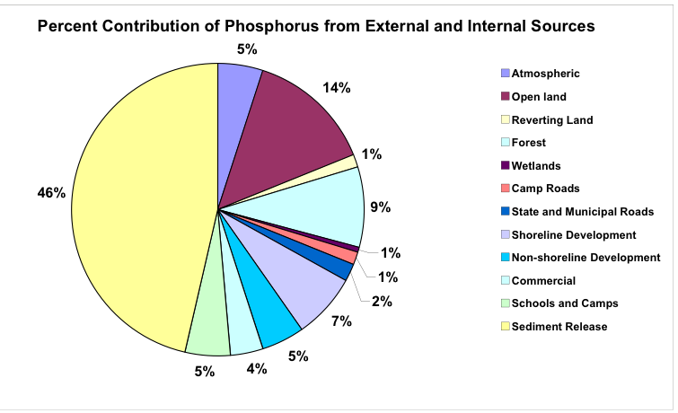
| � When sediment release
of phosphorus is accounted for,
the pie chart looks a lot different.
This is just to illustrate HOW MUCH phosphorus within the lake comes
from the sediments. As you can
see, nearly half of the total phosphorus within China Lake is released from
the sediments according to our best estimate. |
|
| (Do I need explanation of
how P is released from sediments?) |