Temperature
Profile Site 1


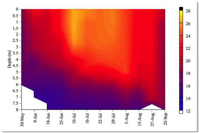
| Here is the temperature
profile for Site 1. Again, we
have depth in the water column along the Y-axis, and the yellow represents
the warmest temperatures and the blue representing the coldest temperatures. As you can see here [Click for box
1], we see the epilimnion, thermocline transition and the hypolimnion during
the summer stratification as shown in the previous slide. We also see the uniform temperature
profile as seen before here [Click for box 2] during the fall mixing
event. One other trend I would
like to point out is throughout the summer, as daylight hours increased and
the sun warmed the water column, the epilimnion moved deeper into the water,
as shown here [Click for arrows], and this affects our epicore samples, which
is a sampling technique designed to be representative of the entire
epilimnion. I will now show the
corresponding DO profile for the study. [Click to next slide] |